Gliders - notes
Revision history
April 2024 (and earlier): A problem with the glider data is that the position information in the files (which is interpolated for the whole mission based on GPS fixes acquired between dives) is not well behaved when the glider is near or at the surface, causing problems for anyone wanting to calculate velocities. We have now improved the way we estimate the velocity over ground that is shown in our plots (for comparison with the glider's dead-reckoning estimate of the depth-averaged current velocity). The impetus for this work was that for a few missions, the tabulated distance over ground estimates (which really, are just for bragging rights) were either missing or implausible. These are now fixed, and all mission maps re-plotted. You will also see that the list of missions can now be sorted in 4 ways, one being to show the 'event-based sampling' missions.
February 5-7 2019:The AODN thredds server will now be checked for new delayed-mode glider data automatically (daily) as well as near-real-time data (hourly). The graphics here will be updated if any new missions are found. The index list will be regenerated regardless to confirm the system is running. In both cases the update process alternates between Slocum and sea gliders. We have also just finished re-plotting all graphics after doing a reload of all data from AODN and changing the colourbar for oxygen saturation from 60-170% to 25-170% to accommodate more of the observed range.
August 2018: Re-plotted all delayed-mode glider data, so now all maps of glider trajectories have the altimeter estimates of surface current for context. This is particularly useful for the seagliders. For example, one might suspect that SG154 went out of calibration off NSW in 2009, just looking at the temperature anomalies. The maps, however, show that the glider went into the centre of a large anticyclonic (warm-core) eddy.
May 2018: On the year-at-a-glance plots, (e.g. this one you have 3 ways to go to the mission segment views: 1) click in the list overlain on inland Australia, 2) a rectangle on the map, or 3) the calendar). In the list, click the glider ID for the standard view, or the mission name for a new series of plots (NRT only) that inform piloting decisions during missions by showing potential future trajectories depending on the heading chosen for the glider to fly. For the 4, 12, and 30-day views the trajectories go 1, 2 and 3 days ahead (with constant heading), or double that (in a 2-stage process) for selected missions. For example, our system predicted that a glider off Jervis Bay could either 1) possibly get back to the deployment location 70km away by fighting the current for 6 days, or 2) go 250km out to, and around, a cyclonic eddy.
April 2018: Added surface current vectors from altimetry to the mission segment views, and annotated the tracks by the date. (29 May: fixed a bug with the annotation. It now correctly annotates the first position of each UTC day)
March 22, 2017: Implemented 3 improvements (before re-plotting all missions) in order to address users' desire to 1) quickly see how glider observations compare with 'normal', 2) see more data at once than shown in the 12d segment pages, and 3) navigate between available images. At present, the best(/only?) available estimate of what is 'normal' in terms of temperature and salinity, for all of Australia's regional seas, is the 2009 version of the CSIRO Atlas of Regional Seas (CARS2009). Our T/S plots of the glider data have always shown this for reference, in part to help identify potential calibration issues. What we have now added is the option to see all glider T and S observations as anomalies, defined as the difference from the CARS2009 estimate for the day-of-year and location of the glider observations. When interpreting these plots of anomaly, users should bear in mind that CARS estimates are smoothed in both space and time, and that these 'average' values may not be ones that are often observed (who has 2.5 children?). Temperature and salinity anomaly are now shown in the all-mission, year-at-a-glance plots as well as the (new) 30d-segment single-mission plots.
February 23, 2016: Replotted all delayed-mode glider data, showing only data with QC flags 1 or 2 ('good' or 'probably good'). The near-real time plots (with no QC screening) are replotted at '_nrt' URLs (rather than being over-written by delayed-mode, leading to ambiguity of source). The index page now lists the processing version of the data. Mission count and time and distance totals are given.
February 17, 2016: Replotted all glider data with the Dissolved Oxygen shown as percent saturation instead of concentration.
March 3, 2015: Replotted all glider data and fixed an error that was preventing the 2015 data from being shown.
November 28, 2014: Slocum glider data also updating continuously. Erroneous GPS positions are now screened out at the plotting stage. ANFOG are working to improve the position QC and error flags. Both Seagliders and Slocum positions are now added in near-real time to the SST plots and animations.
November 20, 2014: Seaglider data updating continuously, index page re-designed for easier navigation, 12-day data segments added, several other minor improvements to the plotting.
October 17, 2014: First mostly-complete release, mostly free of errors.
Introduction to gliders
IMOS operates two types of glider; Seagliders for blue-water missions sampling to 1000m, and Slocum gliders for continental shelf missions. Both types, like Argo profilers, can change their buoyancy, allowing them to sink to a chosen depth then rise back up again. Unlike Argo profilers, however, they have wings so they can glide through the water in a chosen direction. The forward velocity is only about 0.25m/s, which is faster than ocean currents in many places but much slower than strong ocean currents. Glider piloting, consequently, is quite a challenge so missions do not always achieve the planned trajectory. The relative motion of the glider with respect to the water should also be borne in mind when analysing the data. This is why the graphics presented here have a map showing the glider trajectory alongside section views of the sensor data.
File reading and processing issues
There are still several issues to be resolved or documented but both will probably have to wait until some time in November 2014 or later, sorry. The main issue is that salinity from some glider missions is mis-calibrated. Lesser issues are things like un-trapped GPS wobbles (i.e. mid-dive excursions to inland Australia not flagged by LATITUDE_quality_control). Velocity and heading data are missing from the 2014 real-time Slocum glider files. Please note that when we read the data, we are striding through the sensor data, but over-sampling the velocity data, in order to show both on the same page at similar intervals.
Understanding the plots
| Year at a glance | Mission TS | 4- and 12-day mission segments |
|---|---|---|
 |
 |
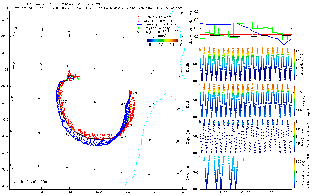 |
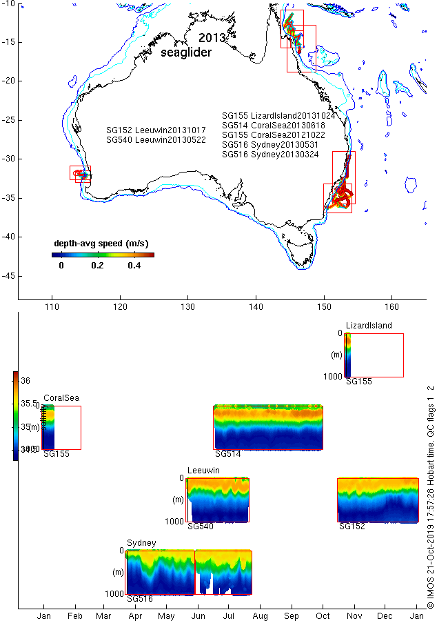
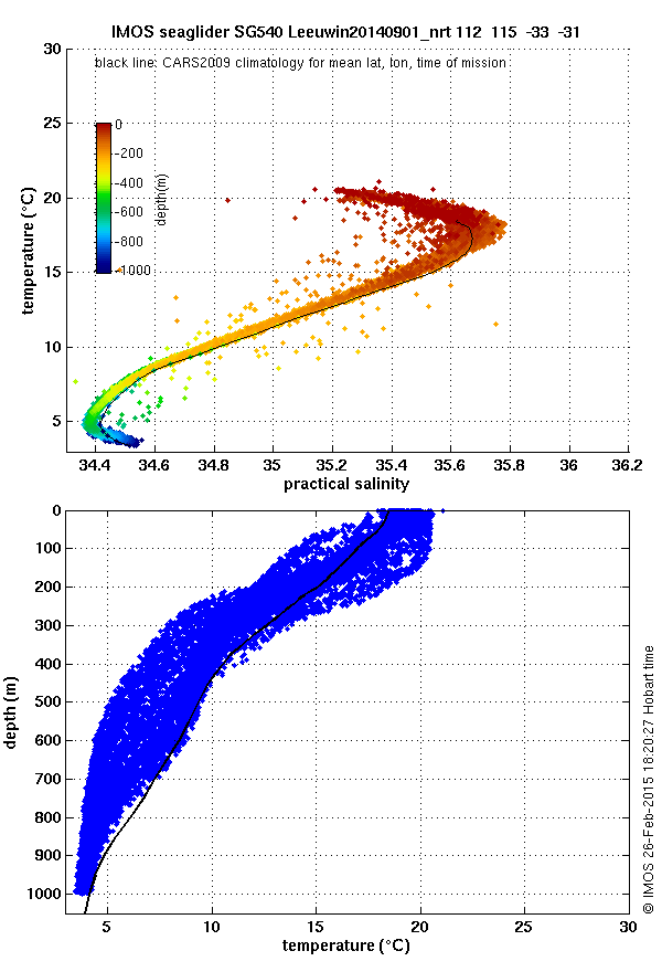
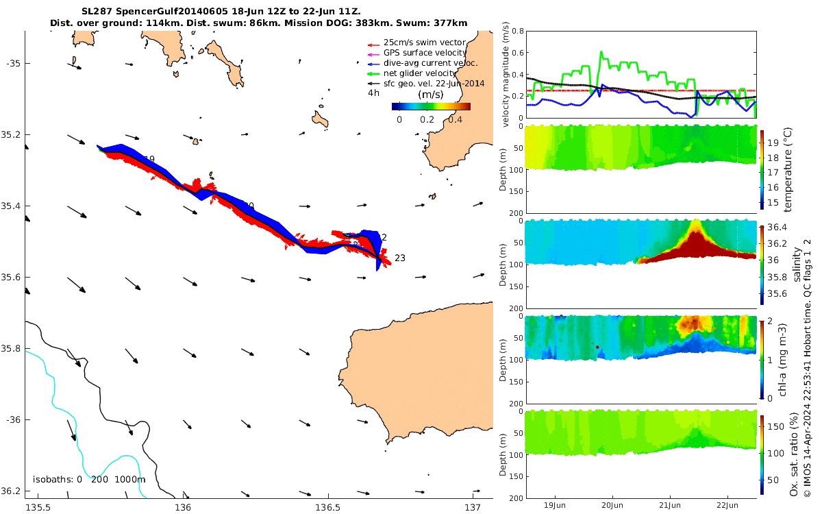
| Map and timeline showing locations and times of the missions, and the depth-range of temperature, salinity, fluorescence and dissolved oxygen data. Anomalies (i.e. the difference from climatology) of the temperature and salinity can be seen by selecting [tempa] or [psala] links. These plots also serve as links to the plots of 4-day, 12-day and 30-day mission segments. Choose between Seaglider and Slocum Gliders, 4, 12d or 30d segments, and the year (delayed-mode or near-real-time for the present year), using the row of links along the top, then click a red box (or the name of the mission listed in central Australia) to see the chosen mission. | Temperature-salinity plots of mission data, colour-coded by depth. These plots are just a quick-look at the mission data compared with the climatological (CARS2009) estimate for the mid-time and point of the mission, to reveal any possible gross calibration errors. | Frames at 12h intervals, each showing 4, 12 or 30 days of mission data (tip: the animation provided is the best way to view these). Left panel: Track of the glider showing 4 velocity vectors along the track: Red: this is the glider's recorded heading shown as a velocity by assuming the speed through the water is 0.25m/s (which is about right when the glider is flying well). Magenta: GPS-based estimates of the water velocity when the glider is at the surface (and therefore not gliding, but possibly subject to breaking waves knocking it through the water). Blue: estimates by the glider's software of the dive-average (i.e. depth-average) water velocity, dead-reckoned from the dive angle and heading data, and GPS positions at the start and end of each dive. Black: velocity over ground estimated from the GPS positions before and after the dive. This velocity is shown as vectors at the beginning and end of the trajectory, and as a colour for the magnitude (i.e. the speed) along the trajectory.Right panels, from top: magnitudes of the velocities, then time-depth sections of sensor data. The dissolved oxygen concentration measurements made by the glider are shown here as % saturation (100 * DO/DOsaturation(t,s)). |
Favourites Gallery
Editor's Choices of glider observations of various oceanographic phenomena (more examples will be added - nominations are welcome):
| Kimberley tidal spiral slocum glider making progress northwards while influenced by strong circular tidal currents | 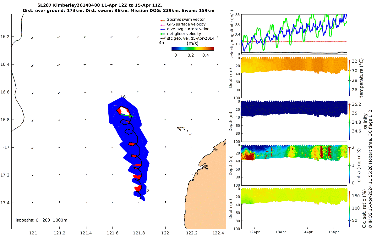 |
 |
Hyper-saline waters in Spencer's Gulf |