Argo temperature and salinity down to 2000m - what's shown
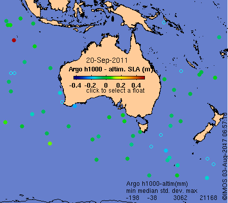
The Argo [position maps] like the example below show floats that reported data
within a few days of the indicated date. The colour-fill of the float indicates the difference between the float's
estimate
of steric height anomaly (relative to 1000m) and the satellite altimeters' estimate of the sea level anomaly
(relative
to the long-term mean, see panel 5 discussion below). Green signals that both observing systems are in
agreement,
while blue or red indicates that there might be a problem we need to investigate. Unfilled circles indicate
floats
that did not produce useful data to at least 1000m. The [PREV] button will go back several years. The [DATE
INDEX]
goes back to 2004.
Click on one of the floats to see a plot like the one below (the example is from the float coded yellow, above, off NSW). You can also reach plots like the one below via the list of [WMO numbers].
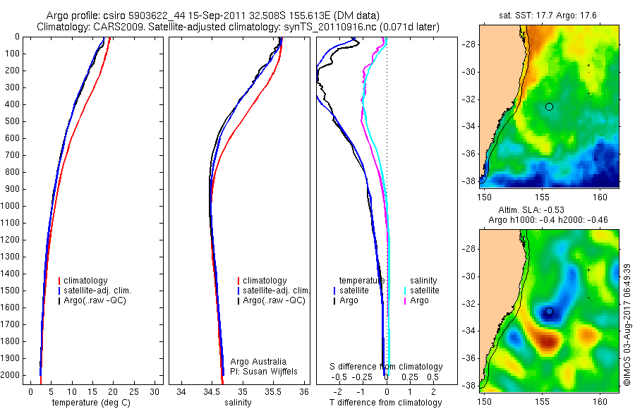
The title of the example plot tells us that:
- This profile is the 44th cycle of the float with WMO number 5903622. The 'CS' signifies that the data was processed by CSIRO. The sampling occurred on 15/09/2011, and the data shown was distributed as profile 424 of the Fast Delivery dataset for 17/09/2011. The surfacing position was 32.508S, 155.613E.
- The seasonal ocean climatology to which the Argo data is compared is CARS2009.
- The daily-updated 'synTS' estimate of subsurface properties to which the Argo data is compared is valid for 17/09/2011, which is a day later than the Argo data. The line colour key refers to this as 'satellite-adjusted climatology' because the estimates are the result of using satellite observations of the sea surface height and temperature (shown at right) to adjust the climatological profile, according to historically-observed relationships between anomalies of surface dynamic height and temperature with sub-surface properties (see Ridgway and Dunn, 2010).
Panels 1 and 2 (from left)
The black lines are the fast delivery versions of the Argo float's temperature and salinity observations. Linetypes: dotted=raw data, dashed=QC'd raw data, dot-dashed=adjusted data, solid=adjusted, QC'd data. The quality control and adjustments are those included in the Argo fast delivery data files. The red lines are climatogical estimates, i.e. what is 'normal' for the time of year at the float's location. The blue lines are synTS at the location of the Argo float. In the example above, Argo and synTS are in near-perfect agreement that the ocean is colder than normal all the way to 2000m and fresher than normal down to 1000m.
Panel 3
These lines show differences from the climatological profiles, of both temperature and salinity. The Argo T, S and P data are only those that pass the fast delivery QC, i.e. flags 1,2 or 5. Dashed lines are the original instrument data, solid lines are adjusted (by the PI), e.g. for known calibration error.
Panel 4
This shows the AMSR-E (Advanced Microwave Scanning Radiometer, which has only coarse spatial resolution but sees through cloud) three-day average sea surface temperature to show the regional context of the Argo profile. The surface-most Argo observation is encoded within the symbol for comparison with the satellite. The colour bar (not shown) is 6K wide and is centered on the climatological value at the float's location.
Panel 5
This shows the altimetric sea level anomaly (colour bar is -0.6 to 0.6m) for comparison with h1000, the surface steric height anomaly relative to 1000m. These are different quantities, the first estimated at coarse resolution from space and the second by an in-situ device, so the estimates are bound to disagree to some extent. They usually do agree within +/-0.15m, however, confirming that most of the sea level anomaly (i.e., the difference from the time-mean of inverse-barometer adjusted sea level) is due to the anomaly (i.e., the difference from the CARS2009 time-mean) of the vertical-integral from 1000m of the water density. This particular float sampled to nearly 2000m so h2000, the steric height anomaly relative to 2000m, has also been calculated and this value (-0.48m) is even closer to the altimetric estimate (-0.51m) than h1000 (-0.4m).
Example 2: A submerged mixed layer
It is not usually as easy as it was for the example above to estimate the subsurface properties of the ocean from satellite data. This is illustrated by the plot below, which describes a relatively warm, but salty and therefore neutrally buoyant, submerged mixed layer at 200m-500m that was not inferrable from the satellite data. This water has come from Bass Strait. Bass Strait water is rarely seen in vertical profiles in the western Tasman Sea (only 7 examples from 2420 profiles since 1982) because the water forms 200 m+ tall lenses at the centre of anti-cyclones (Baird and Ridgway, 2012).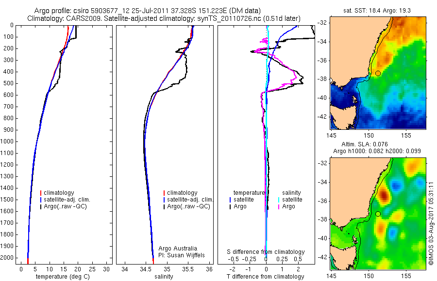
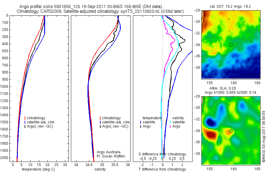
Example 3: disagreement of Argo and synTS
We're not yet sure why the image below shows so much disagreement between synTS and Argo. The synTS estimate of the vertical structure of the warm (and slightly salty) anomaly is confirmed by Argo but the synTS amplitude of that anomaly is much greater than the Argo observations, suggesting that the gridded altimetry has over-estimated the sea level anomaly at the location of the float. Stepping back through time, however, shows that the apparent over-estimation is persistent, and more a property of the eddy (or location) than float number 590658. E.g., see [float 5903653 on 23 Aug]. Confirmation that the sea level anomaly is usually correct in mid September at this location is provided by agreement of the surface geostrophic velocity with the trajectory and speed of surface drifters, e.g. [snapshot SST, altimetry and drifter].